|
Products
Database Search Solution (New Version) Search Control SEO Pager Highlighter Shortcut Controls Crypt Package Free ASP.NET Controls
Geotargeting Component ASP.NET Media Player Control Flash Video Player Control Services
ASP.NET Telecommute Jobs Free IP Location Lookup Test .Net Regular Expressions CSS/Table/DIV Page Layouts Custom Programming Article Sites Master List |
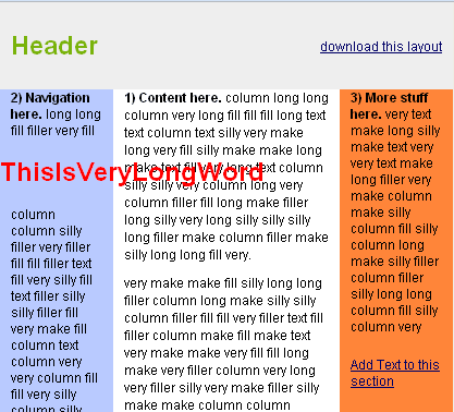
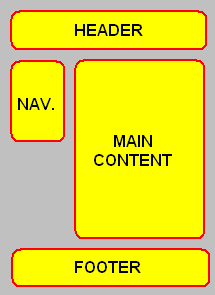
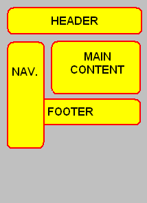
DIV-TABLE-CSS Layout In ASP.NETWhen someone starts learning of ASP.NET, very soon he or she needs to organize text, controls, images and other page elements to get appropriate and nice looking user interface. CSS (Cascading Style Sheets) are one of the popular options for building advanced and manageable page layouts. Although almost any HTML tag could be used, CSS layout is usually based on DIV tags. As opposite to CSS layout with DIV tags, there is page layout with TABLE tag without CSS. Of course, CSS can be used with tables too, but since DIV tag hasn't much parameters, layout with DIV tag depends completely on CSS, including positioning and size of elements. DIV itself has only align parameter which could be right, left or center. By using DIVs with CSS, structure and presentation of page are divided. Tables are initially created for showing tabular data, not for creating page layout. But, one day, somebody is typed this line: <table border="0" > </table> This border="0" part removes borders (lines) of table. Suddenly, designers start to use tables to organize elements of web page. Simple table cell became page layout area, like header, footer, page navigation, content etc. One of the reasons of tables' popularity is because beginner is usually already familiar with table term. Tables are everywhere in real life, from price sheet to timetable. People work with tables from elementary school. On other side, DIVs are something new and some time is needed to understand concept. The good thing is that you don't have to know everything to create your own CSS/DIV page layout. CSS/DIV layouts have been here for a while and there are a lot of CSS/DIV example layouts ready to use. You don't need to start from scratch especially if you are beginner, check http://blog.html.it/layoutgala/, http://layouts.ironmyers.com/ or http://www.free-css.com/free-css-layouts/page1.php to find a lot of tested CSS/DIV page layouts which can be used on your web site or just for learning about features of CSS. Tables strike back - CSS/DIV layout has drawbacks?Whatever used, it is important to create your page layout as simple as possible. It is bad if you have many nested elements, either tables or divs. I noticed that many CSS layouts have problem with too large images. If you or users of your CMS place an image larger than DIV, page layout will probably disarrange. If tables are used, cell that contains large picture will simply elongate which sounds better. I agree that I should not place image larger than area of layout, but I like if my layout is unbreakable and ready, just in case. This problem also occurs if single word is longer than width of DIV. Table cell will naturally extend, but DIV will not. Typical DIV/CSS layout example will look like this:  Also, there is standard advice that tables are made to show tabular data, not to create layout. I agree that tables are planned for showing data, but that alone is not good reason to not use tables for layout or any other task if I find them more useful than DIV element. Next issue about tables is that tables make layout complicate and hard to maintain. It is possible that table layout contains a lot of nested tables, but div layout also could be complicated with a lot of nested divs. Bad design can be made with both tables and divs. Most beginners choose table layout probably because it is easier to understand. Next important thing is the size of HTML code. It is common opinion that tables needs more HTML code than DIV tags. But, it is rarely said how much more HTML code? Let's look at the typical page layout with header, footer and three columns: [ DIV layout ] <div id="header" >Header</div> [ TABLE layout ] <table id="header" ><tr><td>Header</td></tr></table> So, this DIV layout costs 221 characters and same TABLE layout takes 255 characters (with spaces). In this specific case, tables need 34 bytes more. That is probably negligible. If weight of page is an issue, far more important is to have simple design or optimized images than to use DIV only layout. Very common argument against tables is that table design contains styles in HTML which causes heavy pages. That opinion originates from the fact that table has a lot of parameters, like border, background, width etc. Also, there are additional parameters of TR and TD tags. But, the truth is that you are not obligated to use all these parameters inline and that TABLE and CSS are two different things that can't be compared. All that "Table layout vs. CSS layout" discussions on Internet have not sense at all! CSS works with tables. You can ONLY compare TABLE layout vs. DIV layout since they are both HTML tags, but not with CSS which is different dimension. CSS can be used with both tables and divs, or even any other HTML elements if you just set element's id or class parameter. Some designers use unordered lists using UL and LI tags to create page layouts. Table layout can use CSS for everything, even for border="0" part. Argument that tables create larger pages is true only if you compare table layout without CSS vs. DIV layout with CSS. Table layout with CSS or DIV layout with CSS are equal in size. TABLE, TR and TD tags have a lot of parameters, but you can ignore them if you like and use only id or class parameter and then define table appearance in CSS to get small page size and easier maintenance. DIV layout is not adaptable. Take a look at the layout like in image bellow:  Let say only DIVs with CSS are used. If content area has bigger height than navigation area, layout works fine. But otherwise, if you have long navigation and a little content on some page layout will be broken and look like on next image:  Navigation will cover footer area if content is too short. Problem with DIV based layout is that you can't make height of two columns equal if height one or more columns changes depending of content inside (navigation and content area in previous example have not equal height). There are some methods to correct it like using a wrapper DIV, clear attributes and even using a JavaScript. But, there is a simple solution; you can create this layout by using DIVs for header and footer and a table in the middle with one cell for navigation and second cell for content area. Ok, somebody will repeat "tables are not created for layout" but DIV floats are also not ideal for columns. However, in this case hybrid DIV/TABLE/CSS solution is simple, fast to implement, even semantic, light weight and it works perfectly. Tables also have serious limits. For example, in two columns layout example above, if you use DIVs and need to change navigation position to right side it is very easy task. You can do it by changing one file (css style sheet) and design of complete web site is changed. If tables are used you can't change position of left (navigation) and right (content) column with CSS only. This is a big problem on static HTML pages because every single page should be changed separately. Fortunately, in ASP.NET you can solve this problem easily with Master Page. Change single Master Page and you changed complete design too, so maintenance is easy with tables as with DIVs, at least for ASP.NET developers. Also, if you want to support different clients, like desktop computers and mobile devices, you can create different CSS or Master Page and change them programmatically depending of user agent or user accessibility issues. Common argument for DIV layout is that it has potential advantage in search engine optimization (SEO). Search engines like if useful content is on the beginning of page HTML. With DIV layout, you can place content area first in HTML and positioned in the middle of the rendered page. This is not big advantage, much more important factors are incoming links, keyword rich file name, using of H1 tag, keywords in paragraphs, quality content etc. If page layout is not very complex, this is probably venial. But, tables can provide same functionality, since you can create a HTML table with first column in HTML that appear as second column on screen. You can do it with HTML code like this: <table cellpadding="0" cellspacing="0"> TABLE layout has advantage in compatibility with older browsers. DIV layout will probably looks different in older and new web browsers. But, notice that table layout which uses CSS has the same problems. This issue will be less important in the future since more and more visitors use new versions and browsers like Netscape 4 will finally vanish, CSS3 will be widely supported etc. My favorite layout style: TABLEs and DIVs combinedAs you see, both TABLEs and DIVs have its own advantages and disadvantages. My principle is to use the method which solves problem on the best way, not use only because of an ideology or because someone (e.g. W3C) says it is cool. I agree DIVs are better solution for most cases, but TABLEs are better in case when you need same height for two or more adjacent columns which height depends of content. Let's read what official recommendation for tables from http://www.w3.org/TR/REC-html40/struct/tables.html#h-11.1 is: The HTML table model allows authors to arrange data -- text, preformatted text, images, links, forms, form fields, other tables, etc. -- into rows and columns of cells. So, we are encouraged to place data - text, links, forms, images, other tables etc. into rows and columns. Data has very broad meaning. If tables work so well with columns, let use them for column layouts! CSS Page Layout RemarksIn example code snippets I used tag id to set style of tags. Be careful with this because ASP.NET also uses ID for names of objects and IDs should be unique. Nothing will happen if tag not contains runat="server" part. If you need to call some tag with ASP.NET server side code, to avoid confusion better use class parameter instead of id for CSS. Today, some big sites uses DIVs only, some (like Amazon or eBay) uses tables. At this time, search engines don't favorize any method. Which ever design you choose, it is not good have too much tables or divs nested. Let your layout be as simple as possible, it will load faster and save bandwidth. Don't forget the most important thing: quality content. Happy coding! Tutorial toolbar: Tell A Friend | Add to favorites | Feedback | Google |

