|
Products
Database Search Solution (New Version) Search Control SEO Pager Highlighter Shortcut Controls Crypt Package Free ASP.NET Controls
Geotargeting Component ASP.NET Media Player Control Flash Video Player Control Services
ASP.NET Telecommute Jobs Free IP Location Lookup Test .Net Regular Expressions CSS/Table/DIV Page Layouts Custom Programming Article Sites Master List |
How to Use ASP.NET 3.5 ListView & DataPagerASP. NET 3.5 introduced two new data bound controls ListView & DataPager . ListView Web server control enables us to display the data from a data source and if a DataPager is attached then it enables paging in the ListView. ListView is a data bound control similar to DataList and DataRepeater controls but it provides edit, insert, and delete , sort operations on the data that it bounded like a GridView control. Unlike GridView control ListView gives the user full control over the rendering of the page. using templates and styles(CSS) the user can generate clean HTML UI according to his needs. DataPager Web control is used to
page data and display navigation controls for data-bound controls that
implement the IPageableItemContainer interface.ListView implements the
IPageableItemContainer and will use DataPager to support Paging.  Binding ListView to a DataSource.We can use any ASP.NET datasource control to bind to the ListView control by setting the DataSourceID property of the ListView control to the name of the Datasource control. This sample is using AccessDataSource control to bind to the ListView control. <asp:ListView
ID="ListView1"
DataSourceID="AccessDataSource1"
runat="server"
OnSorting="ListView1Sorting" ListView provides built in support for sort functionality. It has a sort event, which can be specified by setting the commandName property of the control, which is part of the ListView control to the 'Sort'. The Sort event supports command argument which can be used to identify which control raised the sort event. The handler for sort event is registered by setting the OnSorting property of the ListView to the handler name. Specifying the Sort Event on the control's<asp:LinkButton runat="server" ID="LinkButton5" Text="Body" CommandName="Sort" CommandArgument="Body" /> Handling the raised sort eventprotected
void ListView1Sorting(Object
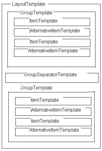
sender, ListViewSortEventArgs e) Specifying ListView TemplatesListView provides various templates which we can use to display the data. The templates are: - LayoutTemplate - ItemTemplate - ItemSeparatorTemplate - GroupTemplate - GroupSeparatorTemplate - EmptyItemTemplate - EmptyDataTemplate - SelectedItemTemplate - AlternatingItemTemplate - EditItemTemplate - InsertItemTemplate The display hierarchy of the various templates in ListView are shown below.  The main layout of a ListView
control is created by defining a LayoutTemplate. The LayoutTemplate will
include controls that acts as a placeholder for the data like Table, Panel,
Label or HTML controls like table, div, or span elements that have a runat
attribute set to "server". GroupTemplate will be used to group the items. The EditItemtemplate, SelectedItemTemplate, InsertItemTemplate are shown at that particular operation like insert, edit, select. ItemSeparatorTemplate, GroupSeparatorTemplate are used to separate the individual items and group Items Separately. We will use each template to embed the necessary HTML controls like table, tr, td, div, span or server controls to display the UI according to our needs. The following example shows the basic structure of a ListView with mandatory templates... <asp:ListView
runat="server"
ID="ListView1"
An item placeholder must be specified on ListView. It will be specified in LayoutTemplate or GroupTemplate. In order to specify a item placeholder set a control's ID property to "itemPlaceholder". The item placeholder control must also specify runat="server". If you want to provide a different ID, you can specify it using the ItemPlaceholderID attribute of the ListView control. If Grouping is used, GroupTemplate will act as place holder for ItemTemplate. In this case a Groupplaceholder must be specified in ListView. An Groupplaceholder can be specified in LayoutTemplate by setting a control's ID property to "groupPlaceholder" or setting the GroupPlaceholderID attribute of the ListView control to a control which is specified in LayoutTemplate. Example code for setting ID properties of control's to "itemPlaceholder", "groupPlaceholder"<asp:ListView
runat="server"
ID="ListView1"
Example code for setting itemPlaceholderID, groupPlaceholderID properties to control's ID's.<asp:ListView
runat="server"
ID="ListView1"
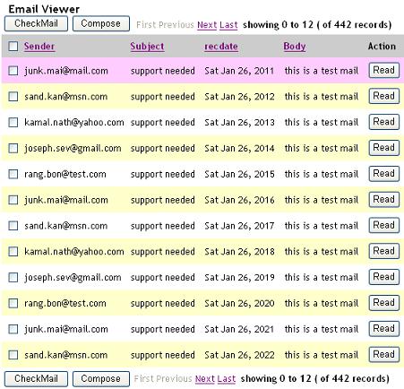
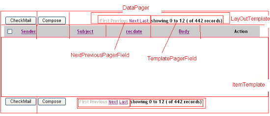
Preparing the LayoutTemplate for the Email ViewerWe need to create the LayoutTemplate as shown below using the necessary HTML controls like table, tr, td (with styles) for formatting and the ASP.Net Server Controls (Buttons, LinkButtons, DataPager) for displaying the Headers as well as footers. We need to use a itemplaceholder for displaying the items from data source.  <LayoutTemplate> Preparing DataPagerThe DataPager control is used to page data and to display navigation controls for data-bound controls that implement the IPageableItemContainer interface. A DataPager control can be associated to the data-bound control by using the PagedControlID property. Alternatively, the DataPager control can be placed inside the data-bound control hierarchy. DataPager control will display navigation controls by adding the pager fields to the control. DataPager supports following types of pager fields. NextPreviousPagerField: Enables to navigate through pages one page at a time, or to jump to the first or last page. It shows first, prev, next, last buttons. The button type may be of Button, Image, LinkButton. NumericPagerField: enables to navigate through pages by displaying page numbers on the datapager. TemplatePagerField: we can create custom UI by using TemplatePagerField. We can use Labels, buttons, images to create custom UI as well as programmatic control of the DataPager.  In order to create the DataPager according to the above image we need to use NumericPagerField as well as TemplatePagerField as part of the DataPager Fields. We can use DataPager control's properties like PageSize, TotalRowCount, StartRowIndex to create the TemplatePagerField. PageSize gives the no of the pages currently displayed in DataPager. TotalRowCount is the no of rows presented in the datasource attached to the DataPager. StartRowIndex is the current first row's index in the data source . <asp:DataPager
runat="server"
ID="ItemDataPager"
PageSize="12"
PagedControlID="ListView1"> Preparing ItemTemplate & Alternative ItemTemplateWe need to embed the necessary HTML tags as well as Server controls like checkboxes, labels, buttons in order to get the following look for the ItemTemplates as well as AlternativeItemTemplates. The data will be bounded to the properties of the control's by using inline ASP.Net code <%#Eval("datafieldname")%>, where datafiledname is the column name in the datasoure.  <ItemTemplate> Preparing EditItemTemplate & InsertItemTemplateSimilarly we can create EditItemTemplate as well as InsertItemTemplate, but instead of labels we will use TextBoxes like below.  <EditItemTemplate>  <InsertItemTemplate> ConclusionDataPager is nice control for some scenarios, but it should be much better. It looks like DataPager always select complete data source (it just use data source of ListView). That is not efficient, even not acceptable if you have more than 100 pages. In that case it is better to select only page you want to show, instead of selecting all rows from large table. Also, DataPager works only with ListView. It cannot use Repeater or DataList. If you need more professional pager control which works with GridView, Repeater, ListView, DataList and every other control, use optimized paging with stored procedures, alphabetic, tags or even features like vertical or roman numbers paging you can get SEO Pager Control, the best software in this category. This tutorial is written by RELIANCE CONSULTING. Tutorial toolbar: Tell A Friend | Add to favorites | Feedback | |

