|
Accessibility In ASP.NET Web Site
Accessibility by term means something which is accessible. An accessible website is one which is
accessible by everyone. People with any kind of disabilities also should be able
to use a website same like a normal person. Major efforts have been done in
standardizing the approach by World Wide Web Consortium's and Web Accessibility
Initiative. Their efforts have also produced a set of guidelines which comes
under DDA (Disability Discrimination Act). There are set of standards as WCAG
1.1, WCAG 1.2, WCAG 1.3 and Access Board Section 508. These standards have a set
of checklist which one has to consider making a website accessible.
Web Accessibility Initiative (WAI)
has taken steps to prepare guidelines to make websites, software, and tools to
be accessible. Websites are vital part of society as the trend of social
websites are increasing day by day. So people with disabilities also need to be
a valid user of the website. Otherwise, say you have a "Social website", they
would be only accessible to say 65% normal customers, and 35% of disabled
persons would not be able to see or check out what your business is. This way
not only you are blocking your clientage but also being unfair to them by not
allowing them to access your product.
How can we say that a person is disabled, and how can we
tackle this in our website.
1- A person comes to your website for shopping but he is color blind
Solution:
We can use proper style sheets to manage colors and text
sizes so any user can adjust according to need.
We normally see such panels on top of accessible websites
to adjust the visual parameters
2- Say you are running a music website, and a deaf persons visits your
website, how will you tackle this as the visitor would not be able to listen as
he is disabled.
Solution:
You need to add audio captions in place of the music
control, so that the content is accessible to them as well.
3- People visit your website with Dyslexia problem, in this case user
find it difficult to interpret the written content on the website, it is a
neurological disability, and is not an intellectual disability.
Solution:
More options to search pages, provide a graphical
representation as well.
4- Suppose a visitor is deaf and blind both
Solution:
Use Style sheets, accessible
multimedia with audio captions if any, should be independent of devices, use
proper Xhtml techniques
There can be many more scenarios
that exists and can be tackled if we see the complete checklist of World Wide
Web Consortium's and Web Accessibility Initiative.
Microsoft based websites developed
in ASP.NET can be optimized and configured of Web accessibility standards by
considering the rules in our mind. Let's take an example site and try to see how
we can develop an accessible website and what steps we need to make to make this
website accessible.
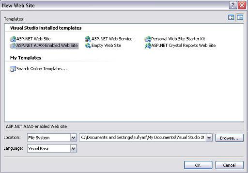
Let's create an Ajax Enabled ASP.NET website
Clicking on "OK" button will generate the website with a default page, and
put a code in it as well. Let's analyze the code below which .net produces for
us and see if it is accessible.
1 <%@
Page Language="VB"
AutoEventWireup="true"
CodeFile="Default.aspx.vb"
Inherits="_Default"
%>
2
3 <!DOCTYPE
html PUBLIC
"-//W3C//DTD XHTML 1.1//EN"
"http://www.w3.org/TR/xhtml11/DTD/xhtml11.dtd">
4 <html
xmlns="http://www.w3.org/1999/xhtml">
5 <head
runat="server">
6
<title>Untitled
Page</title>
7 </head>
8 <body>
9
<form
id="form1"
runat="server">
10
<asp:ScriptManager
ID="ScriptManager1"
runat="server"
/>
11
<div>
12
</div>
13
</form>
14 </body>
15 </html>
Visual Studio.net has a built in accessibility checklist
option in the toolbar.
Click  icon icon
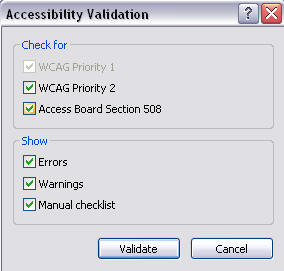
A window will popup like below:
Here we can see that WCAG Priority checklist 1 is
disabled as that has the most common points we need to adhere in our coding and
are sort of compulsory as well. Lets click validate to see that we have any
"Errors", "Warnings" or "Manual CheckList" in our code which we have missed.
Note here that we need to fully remove the Warnings as they are most important,
and then on second priority we need to check for errors and on least priority
are our Manual Checklists.

Click on image to see larger
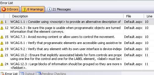
Here we can see that though we have not done any coding
yet, but Microsoft has checked the code against the standardized checklist, and
produced for us a little error report, luckily we do not have any errors yet. We
receive set of warnings and messages, which are certainly optional for us to
correct or not.
Let's add a script block here in above code as below:
1 <%@
Page Language="VB"
AutoEventWireup="true"
CodeFile="Default.aspx.vb"
Inherits="_Default"
%>
2
3 <!DOCTYPE
html PUBLIC
"-//W3C//DTD XHTML 1.1//EN"
"http://www.w3.org/TR/xhtml11/DTD/xhtml11.dtd">
4 <html
xmlns="http://www.w3.org/1999/xhtml">
5 <head
runat="server">
6
<title>Untitled
Page</title>
7
8 </head>
9 <body>
10 <script
language
="javascript" type="text/javascript"
></script>
11
<form
id="form1"
runat="server">
12
<asp:ScriptManager
ID="ScriptManager1"
runat="server"
/>
13
<div>
14
</div>
15
</form>
16 </body>
17 </html>
Now check for accessibility by clicking on validate button
See the warning number 1, it says that we should also
provide a no script tag. off course it is necessary that we should provide a no
script tag, as if JavaScript is disabled then our code behavior would be
disturbed. Similarly for frames we need to add a <noframes> tag and for <object>
we should provide a <noobject> tag. Otherwise you better understand what
possibly could happen.
This way whenever you produce some code, do check against
the checklist, as visual studio.net 2005 and 2008 have awesome support to check
for accessibility errors so one should make a habit of validations and rules.
Visual studio assists in developing accessible websites to the fullest but we as
developers show laziness or sometimes due to deadlines we are in hassle, and we
do not care about. But later on we have to pay for extra time as we always get
cross browser websites. Let's follow the same example and see how Visual Studio
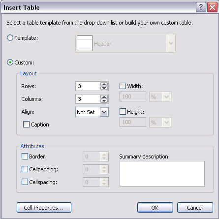
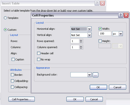
assists us in development. Let's add a table in above code.
Here we can see that we are asked to provide all the information including
summary description and other attributes, though we also need to add table
headers and captions where necessary to make a table fully accessible. Let's see
a fully accessible code with a table below:
1 <%@
Page Language="VB"
AutoEventWireup="true"
CodeFile="Default.aspx.vb"
Inherits="_Default"
%>
2
3 <!DOCTYPE
html PUBLIC
"-//W3C//DTD XHTML 1.1//EN"
"http://www.w3.org/TR/xhtml11/DTD/xhtml11.dtd">
4 <html
xmlns="http://www.w3.org/1999/xhtml">
5 <head
runat="server">
6
<title>Untitled
Page</title>
7
8 </head>
9 <body>
10 <script
language
="javascript" type="text/javascript"
></script><noscript></noscript>
11
<form
id="form1"
runat="server"
>
12
<asp:ScriptManager
ID="ScriptManager1"
runat="server"
/>
13
<div>
14
<div
style="text-align:
left">
15
<table
border="1"
cellpadding="1"
cellspacing="1"
summary="This is
a demo table">
16
<caption>
17
</caption>
18
<thead>
19
20
</thead>
21
<tr>
22
<th></th>
23
<th></th>
24
<th></th>
25
</tr>
26
<tr>
27
<td
style="width:
100px">
28
</td>
29
<td
style="width:
100px">
30
</td>
31
<td
style="width:
100px">
32
</td>
33
</tr>
34
<tr>
35
<td
style="width:
100px">
36
</td>
37
<td
style="width:
100px">
38
</td>
39
<td
style="width:
100px">
40
</td>
41
</tr>
42
<tr>
43
<td
style="width:
100px">
44
</td>
45
<td
style="width:
100px">
46
</td>
47
<td
style="width:
100px">
48
</td>
49
</tr>
50
</table>
51
</div>
52
53
</div>
54
</form>
55 </body>
56 </html>

Click on image to see larger
It is clear that we have reduced the warnings to nine and there are zero
errors in the list.
Apart from Visual Studio, you can also check your website for accessibility
and other standards on URL below:
http://uitest.com
http://validator.w3.org
Hope this discussion will help the developers to have an idea for how to make
the ASP.NET websites accessible and cross browser compatible.
For reference i am providing the checklist provided by W3C
Accessibility Priorities
Each checkpoint has a priority level assigned by the Working Group based on
the checkpoint's impact on accessibility.
[Priority 1]
A Web content developer must satisfy this checkpoint.
Otherwise, one or more groups will find it impossible to access information
in the document. Satisfying this checkpoint is a basic requirement for some
groups to be able to use Web documents.
[Priority 2]
A Web content developer should satisfy this checkpoint.
Otherwise, one or more groups will find it difficult to access information
in the document. Satisfying this checkpoint will remove significant barriers
to accessing Web documents.
[Priority 3]
A Web content developer may address this checkpoint.
Otherwise, one or more groups will find it somewhat difficult to access
information in the document. Satisfying this checkpoint will improve access
to Web documents.
Some checkpoints specify a priority level that may change under certain
(indicated) conditions.
Web Site Accesibility: Priority 1 checkpoints
| In General (Priority 1)
|
Yes
|
No
|
N/A |
|
1.1 Provide a text equivalent for every non-text element (e.g.,
via "alt", "longdesc", or in element content). This includes:
images, graphical representations of text (including symbols), image
map regions, animations (e.g., animated GIFs), applets and
programmatic objects,
ascii art, frames, scripts, images used as list bullets,
spacers, graphical buttons, sounds (played with or without user
interaction), stand-alone audio files, audio tracks of video, and
video.
|
|
|
|
|
2.1 Ensure that all information conveyed with color is also
available without color, for example from context or markup.
|
|
|
|
|
4.1 Clearly identify changes in the natural language of a
document's text and any text equivalents (e.g., captions).
|
|
|
|
|
6.1 Organize documents so they may be read without style sheets.
For example, when an HTML document is rendered without associated
style sheets, it must still be possible to read the document.
|
|
|
|
|
6.2 Ensure that equivalents for dynamic content are updated when
the dynamic content changes.
|
|
|
|
|
7.1 Until user agents allow users to control flickering, avoid
causing the screen to flicker.
|
|
|
|
|
14.1 Use the clearest and simplest language appropriate for a
site's content.
|
|
|
|
| And if you use images and image maps (Priority 1)
|
Yes
|
No
|
N/A |
|
1.2 Provide redundant text links for each active region of a
server-side image map.
|
|
|
|
|
9.1 Provide client-side image maps instead of server-side image
maps except where the regions cannot be defined with an available
geometric shape.
|
|
|
|
| And if you use tables (Priority 1)
|
Yes
|
No
|
N/A |
|
5.1 For data tables, identify row and column headers.
|
|
|
|
|
5.2 For data tables that have two or more logical levels of row
or column headers, use markup to associate data cells and header
cells.
|
|
|
|
| And if you use frames (Priority 1)
|
Yes
|
No
|
N/A |
|
12.1 Title each frame to facilitate frame identification and
navigation.
|
|
|
|
| And if you use applets and scripts (Priority 1)
|
Yes
|
No
|
N/A |
|
6.3 Ensure that pages are usable when scripts, applets, or other
programmatic objects are turned off or not supported. If this is not
possible, provide equivalent information on an alternative
accessible page.
|
|
|
|
| And if you use multimedia (Priority 1)
|
Yes
|
No
|
N/A |
|
1.3 Until user agents can automatically read aloud the text
equivalent of a visual track, provide an auditory description of the
important information of the visual track of a multimedia
presentation.
|
|
|
|
|
1.4 For any time-based multimedia presentation (e.g., a movie or
animation), synchronize equivalent alternatives (e.g., captions or
auditory descriptions of the visual track) with the presentation.
|
|
|
|
| And if all else fails (Priority 1)
|
Yes
|
No
|
N/A |
|
11.4 If, after best efforts, you cannot create an accessible
page, provide a link to an alternative page that uses W3C
technologies, is accessible, has equivalent information (or
functionality), and is updated as often as the inaccessible
(original) page.
|
|
|
|
Web Site Accessibility - Priority 2 checkpoints
| In General (Priority 2)
|
Yes
|
No
|
N/A |
|
2.2 Ensure that foreground and background color combinations
provide sufficient contrast when viewed by someone having color
deficits or when viewed on a black and white screen. [Priority 2 for
images, Priority 3 for text].
|
|
|
|
|
3.1 When an appropriate markup language exists, use markup
rather than images to convey information.
|
|
|
|
|
3.2 Create documents that validate to published formal grammars.
|
|
|
|
|
3.3 Use style sheets to control layout and presentation.
|
|
|
|
|
3.4 Use relative rather than absolute units in markup language
attribute values and style sheet property values.
|
|
|
|
|
3.5 Use header elements to convey document structure and use
them according to specification.
|
|
|
|
|
3.6 Mark up lists and list items properly.
|
|
|
|
|
3.7 Mark up quotations. Do not use quotation markup for
formatting effects such as indentation.
|
|
|
|
|
6.5 Ensure that dynamic content is accessible or provide an
alternative presentation or page.
|
|
|
|
|
7.2 Until user agents allow users to control blinking, avoid
causing content to blink (i.e., change presentation at a regular
rate, such as turning on and off).
|
|
|
|
|
7.4 Until user agents provide the ability to stop the refresh,
do not create periodically auto-refreshing pages.
|
|
|
|
|
7.5 Until user agents provide the ability to stop auto-redirect,
do not use markup to redirect pages automatically. Instead,
configure the server to perform redirects.
|
|
|
|
|
10.1 Until user agents allow users to turn off spawned windows,
do not cause pop-ups or other windows to appear and do not change
the current window without informing the user.
|
|
|
|
|
11.1 Use W3C technologies when they are available and
appropriate for a task and use the latest versions when supported.
|
|
|
|
|
11.2 Avoid deprecated features of W3C technologies.
|
|
|
|
|
12.3 Divide large blocks of information into more manageable
groups where natural and appropriate.
|
|
|
|
|
13.1 Clearly identify the target of each link.
|
|
|
|
|
13.2 Provide metadata to add semantic information to pages and
sites.
|
|
|
|
|
13.3 Provide information about the general layout of a site
(e.g., a site map or table of contents).
|
|
|
|
|
13.4 Use navigation mechanisms in a consistent manner.
|
|
|
|
| And if you use tables (Priority 2)
|
Yes
|
No
|
N/A |
|
5.3 Do not use tables for layout unless the table makes sense
when linearized. Otherwise, if the table does not make sense,
provide an alternative equivalent (which may be a linearized
version).
|
|
|
|
|
5.4 If a table is used for layout, do not use any structural
markup for the purpose of visual formatting.
|
|
|
|
| And if you use frames (Priority 2)
|
Yes
|
No
|
N/A |
|
12.2 Describe the purpose of frames and how frames relate to
each other if it is not obvious by frame titles alone.
|
|
|
|
| And if you use forms (Priority 2)
|
Yes
|
No
|
N/A |
|
10.2 Until user agents support explicit associations between
labels and form controls, for all form controls with implicitly
associated labels, ensure that the label is properly positioned.
|
|
|
|
|
12.4 Associate labels explicitly with their controls.
|
|
|
|
| And if you use applets and scripts (Priority 2)
|
Yes
|
No
|
N/A |
|
6.4 For scripts and applets, ensure that event handlers are
input device-independent.
|
|
|
|
|
7.3 Until user agents allow users to freeze moving content,
avoid movement in pages.
|
|
|
|
|
8.1 Make programmatic elements such as scripts and applets
directly accessible or compatible with assistive technologies
[Priority 1 if functionality is important and not presented
elsewhere, otherwise Priority 2.]
|
|
|
|
|
9.2 Ensure that any element that has its own interface can be
operated in a device-independent manner.
|
|
|
|
|
9.3 For scripts, specify logical event handlers rather than
device-dependent event handlers.
|
|
|
|
Web Site Accessibility - Priority 3 checkpoints
| In General (Priority 3)
|
Yes
|
No
|
N/A |
|
4.2 Specify the expansion of each abbreviation or acronym in a
document where it first occurs.
|
|
|
|
|
4.3 Identify the primary natural language of a document.
|
|
|
|
|
9.4 Create a logical tab order through links, form controls, and
objects.
|
|
|
|
|
9.5 Provide keyboard shortcuts to important links (including
those in client-side image maps), form controls, and groups of form
controls.
|
|
|
|
|
10.5 Until user agents (including assistive technologies) render
adjacent links distinctly, include non-link, printable characters
(surrounded by spaces) between adjacent links.
|
|
|
|
|
11.3 Provide information so that users may receive documents
according to their preferences (e.g., language, content type, etc.)
|
|
|
|
|
13.5 Provide navigation bars to highlight and give access to the
navigation mechanism.
|
|
|
|
|
13.6 Group related links, identify the group (for user agents),
and, until user agents do so, provide a way to bypass the group.
|
|
|
|
|
13.7 If search functions are provided, enable different types of
searches for different skill levels and preferences.
|
|
|
|
|
13.8 Place distinguishing information at the beginning of
headings, paragraphs, lists, etc.
|
|
|
|
|
13.9 Provide information about document collections (i.e.,
documents comprising multiple pages.).
|
|
|
|
|
13.10 Provide a means to skip over multi-line ASCII art.
|
|
|
|
|
14.2 Supplement text with graphic or auditory presentations
where they will facilitate comprehension of the page.
|
|
|
|
|
14.3 Create a style of presentation that is consistent across
pages.
|
|
|
|
| And if you use images and image maps (Priority 3)
|
Yes
|
No
|
N/A |
|
1.5 Until user agents render text equivalents for client-side
image map links, provide redundant text links for each active region
of a client-side image map.
|
|
|
|
| And if you use tables (Priority 3)
|
Yes
|
No
|
N/A |
|
5.5 Provide summaries for tables.
|
|
|
|
|
5.6 Provide abbreviations for header labels.
|
|
|
|
|
10.3 Until user agents (including assistive technologies) render
side-by-side text correctly, provide a linear text alternative (on
the current page or some other) for all tables that lay out
text in parallel, word-wrapped columns.
|
|
|
|
| And if you use forms (Priority 3)
|
Yes
|
No
|
N/A |
|
10.4 Until user agents handle empty controls correctly, include
default, place-holding characters in edit boxes and text areas.
|
|
|
|
This tutorial is written by Ali Sufyan.
Tutorial toolbar: Tell A Friend | Add to favorites | Feedback | Google
|

