

Products
Database Search Solution (New Version) Search Control SEO Pager Highlighter Shortcut Controls Crypt Package Free ASP.NET Controls
Geotargeting Component ASP.NET Media Player Control Flash Video Player Control Services
ASP.NET Telecommute Jobs Free IP Location Lookup Test .Net Regular Expressions CSS/Table/DIV Page Layouts Custom Programming Article Sites Master List |
Control Template in DataGrid, Repeater and DataList ControlsA template is a combination of HTML elements, controls and embedded server controls, and can be used to customize and manipulate the layout of a control. ASP.NET provides three server controls for displaying data in a customized layout: Datagrid control, Repeater control, and Datalist control. The layout for these controls can be customized using templates. For example you can use a template to customize the layout of the individual rows. Alternating rows, or selected rows of control. At runtime, the specified template is rendered on the page. There are different portions of a control, such as the header, footer. item and separator, which you can customize according to your requirements by using templates. There are different types of templates available depending on the portion of control for which the template is defined. The following table lists the available templates and the sever controls that support them:
You can create and edit a template for a server control either by using Visual Designer or by editing ASP.NET code. When you use Visual Designer, the corresponding ASP.NET code is generated automatically. Now we will be discussing the process of creating and editing templates in detail, in these sections of the Repeater, Datagrid and Datalist controls for which these templates are used. Repeater Control TemplateA Repeater control displays data from different data sources by using customized layouts. It does not has a default layout. You need to create templates to provide a layout to a Repeater control. You can create tables, grids, comma separated lists, and bulleted or numbered lists to display the data in a Repeater control. When you add a Repeater control to your WebForm, you can set its properties by using Properties window and then create different templates to provide the layout to the Repeater control. The ItemTemplate is mandatory as it provides a basic layout to the Repeater control. Other Templates can also be created to enhance the layout Repeater Template - Example project In this demo, I have used Repeater control to create a table with a header row, and three columns with one column containing a button control. The application shows a table of product list along with their prices and when a user clicks on to know more about the product a decription message is displayed. Perform the following steps for this demo:
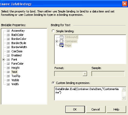
<HeaderTemplate> It is to note here that, to display the rows from a datasource in the individual items of the any of the data controls, you need to bind the embedded controls with the datasource of the container control. To accomplish this, you need to use the DataBinder.Eval ( ) method. The DataBinder.Eval ( ) method is used to evaluate the late bound data binding expression. This method simplifies the casting of the bound data to the required data type. It has the following sysntax: <% # DataBinder.Eval ( ContainerName.DataFieldName, {FormatString}) %> In the preceding section:
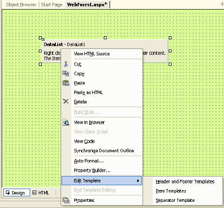
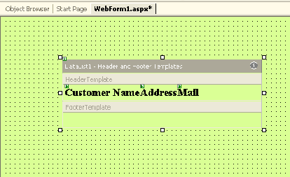
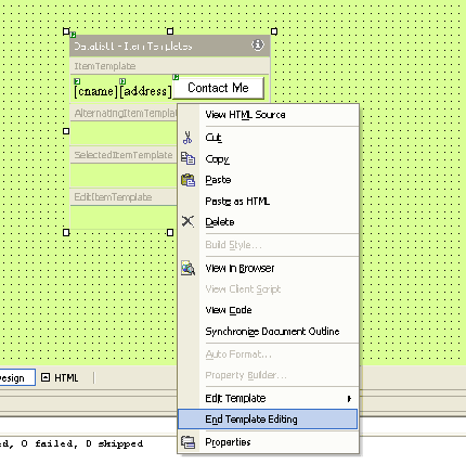
After this we will be adding functionality for the label control through which the description will be displayed. And when you will click the "Know More" button, output look as shown in the figure: 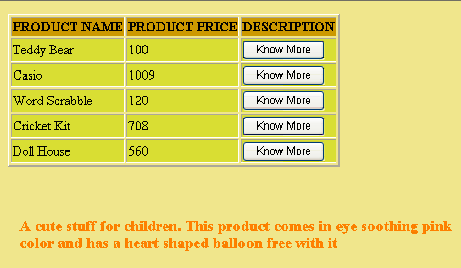 You can download the example Control Templates project through this link. DataList Control TemplateThis is very much like the Repeater control, except that it has some additional properties and templates. These properties and templates of the DataList control allow you to display its data in a diverse way. The DataList control displays data from a data source in a form of a list. It also provides data selection and editing capabilities. A DataList control also has the RepeatDirection and RepeatColumn properties, which provide the layout of the data in the horizontal and vertical direction. To create or edit a template for a DataList control, perform the following steps:
 The DataList Control would appear as below: 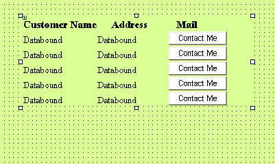 The default layout of a DataList control displays data in one vertical column, but you can specify multiple columns for displaying data by setting the RepeatColumns property. You can specify the order of display as either vertical or horizontal by selecting its RepeatDirection property. The RepeatLayout property of a DataList control can be used to specify the type of layout for displaying data in the control. The flow layout displays the list of items in a word processing document format and a table layout displays the list of items in a HTML table. DataGrid Control TemplateThe DataGrid control offers all the functions of the DataList control and, in addition the control provides sorting and paging capabilities. Its AllowSorting control provides sorting and redisplaying data on the selection of a column header. A selected page of data can be displayed from a large data source by using its AllowPaging property. DataGrid controls do not have the built-in capability to scroll its content in a fixed area. All of the rows you add are displayed in the Web Form. Therefore, developers build their own custom mechanisms to implement paging. While implementing paging, you can decide the maximum number of rows that a table can contain and add buttons or hyperlinks at the bottom of the table in order to allow users to navigate through the records. In ASP.NET, you can easily scroll between pages of dynamically determined sizes in a DataGrid control. to do so: Enable paging of the datagrid control by setting its AllowPaging property to True. Assign a value to the PageSize property to specify the rows that you want to see for each page. Make sure the data source bound to the datagrid control is refreshed whenever you scroll back and forth. The datagrid raises the OnPageIndexChanged event whenever you click the pager to jump to a certain page. A datagrid server control binds and displays data in a tabular format. Each record in a data source is displayed as a row in the grid. You can customize the layout of a DataGrid control by using a template. There are different types of columns that you can create for a datagrid control:
When you right click the datagrid and select property builder from the short cut menu, the datagrid properties window appears where you can format the columns, paging and more, as shown in the figure below: 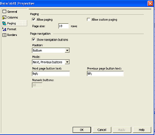 Tutorial toolbar: Tell A Friend | Add to favorites | Feedback | |