

Products
Database Search Solution (New Version) Search Control SEO Pager Highlighter Shortcut Controls Crypt Package Free ASP.NET Controls
Geotargeting Component ASP.NET Media Player Control Flash Video Player Control Services
ASP.NET Telecommute Jobs Free IP Location Lookup Test .Net Regular Expressions CSS/Table/DIV Page Layouts Custom Programming Article Sites Master List |
In Details Guide To DetailsView ControlDetailsView server control is used to display, delete, insert or edit a single record from data source. DetailsView control is often used in master/detail scenario with GridView control. To work with individual records in ASP.NET 1.1 you needed additional programming. But, in ASP.NET 2.0 or later we can use specialized DetailsView and FormView controls. More about FormView control you can read in FormView Control: Step by Step tutorial. DetailsView control is located in Visual Studio toolbox, under Data tab.  To start work with DetailsView control, grab control from the toolbox and place it on web form. By default, DetailsView control looks like in an image bellow: 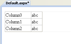 To work with records, first we need to connect DetailsView control with some data source. In this example, I will use SqlDataSource control to bind DetailsView to SQl Server database. Here is a markup code for this SqlDataSource control: <asp:SqlDataSource ID="sdsForm" runat="server" This data source contains commands for all four basic operations: Select, Update, Insert and Delete. If you only need to show record in read-only mode, your data source control needs only Select command. After we created SqlDataSource control, we need to associate it with DetailsView control. You can do that in design view, like on next image: 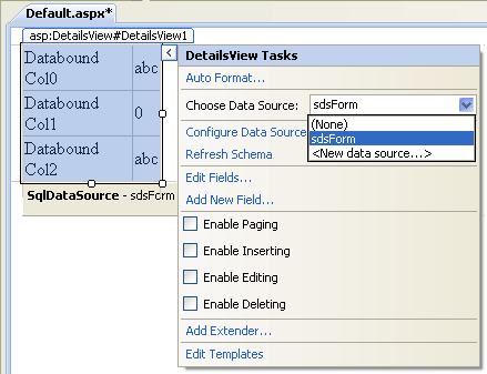 Also, you can do this if you set DataSourceID property of DetailsView control to the name of your data source control. To start an example, you need a database. SqlDataSource control above uses a database with Products and Categories tables. You can create these tables in your database with SQL code like this: For table Products CREATE TABLE Products( And, very simple table Categories CREATE TABLE Categories( Fill tables with some data and run the example to see how it works. Of course, you can use your own existing table, just adopt SqlDataSource commands to suit your table structure. Run the example and DetailsView control will show first record, similar to the next image: 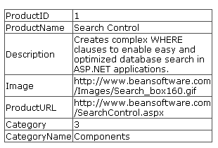 How to update, insert and delete data and enable paging with DetailsView controlUntil now, our example will only show one record in read-only mode. To enable paging, updating, deleting or adding new records, check proper checkboxes like in an image bellow: 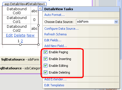 This action will produce markup code like this: <asp:DetailsView ID="DetailsView1" runat="server" DataSourceID="sdsForm" AllowPaging="True"> Before using an example you need to set DataKeyNames property of DetailsView control to the name of table primary key column. In our case table primary key column is named "ProductID". Now, you can start an example again and joy in new features. Test paging, updating, deleting and inserting a new record to see how it works. You'll see new buttons Edit, Delete and New link buttons. Note that we did all this without writing single line of C# or VB.NET code! Output should look similar to image bellow: 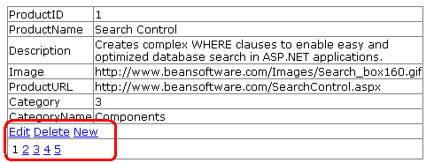 How to provide better layout with DetailsView controlNow, the example is completely functional, although it looks ugly. For example, instead of showing an URL of image, it would be better to show image itself, instead of product url it will be better to show clickable link etc.By default, DetailsView control has AutoGenerateRows property set to true. That means that all fields will be generated at run time, depending of what fields your data source contains. This is fast solution, but if you want more control over the way how fields will be presented, you need to set AutoGenerateRows property to False. Now you must specify needed fields manually. DetailsView control has seven types of fields, every with different purpose: BoundField - This is default field, used when AutoGenerateRows is true. You can use it for simple text data type Implemented in our example, markup code with custom fields used could look like this: <asp:DetailsView ID="DetailsView1" runat="server" DataSourceID="sdsForm" Height="50px" Width="225px" AllowPaging="True" AutoGenerateRows="false"> Category selection uses data from second table. To bind categories to DropDownList control we need to add another data source control. Markup for second SqlDataSource control looks like this (note that we need just SelectCommand here): <asp:SqlDataSource ID="sdsCategory" runat="server" ConnectionString="<%$ ConnectionStrings:beanConnStr %>" SelectCommand="SELECT ID AS CategoryID, CategoryName FROM Categories"></asp:SqlDataSource> Output will now look like this: 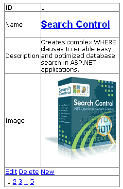 This layout looks definitely more user friendly. ImageField is used to show an image, primary key is presented as a read-only field and used TemplateField to enable advanced layout in product name and category selection. TemplateField is a little harder to use compared to other types of fields, but it allows almost unlimited formatting options. Practically, you can place complete all table columns in one TemplateField. TemplateField contains ItemTemplate, EditItemTemplate and InsertItemTemplate sub tags used to specify different layouts for showing and editing of existing records or adding a new record. In ItemTemplate Eval() method is used since Bind() provides one direction read-only binding. For EditItemTemplate and InsertItemTemplate Bind() method is used. Bind() method enables binding in two directions. Selection of category is presented in different layouts: as simple text in read-only mode and with DropDownList control in EditItemTemplate and InsertItemTemplate, so users can easily select category from offered category names in DropDownList, instead of writing of category ID to TextBox control. 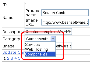 DetailsView control layout when updating an existing record Adding Header and Footer to get more professional lookTo add Header and Footer elements to DetailsView control, use HeaderTemplate and FooterTemplate sub tags. Very simple imlementation of header and footer could look like this: <HeaderTemplate> Adding styles in DetailsView controlThe easiest way to add professional formatting to DetailsView control is to use AutoFormat option. Click on AutoFormat... link button on DetailsView tasks or in Property window and choose one of few predefined styles. I'll choose Colorful auto format that will produce output like in next image: 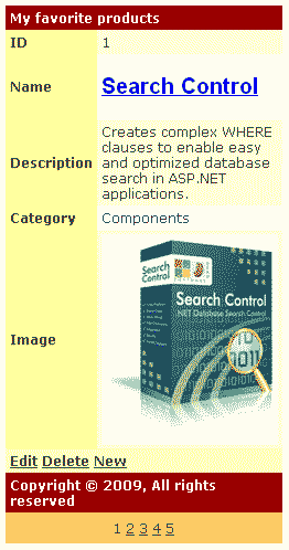 If AutoFormat option can't satisfy your requirements, you can set styles of each element separately. DetailsView control has a number of style properties: AlternatingRowStyle - Style of every alternate row Also, you can set things like background control image or table cell spacing by using properties from Appearance section. Custom paging with DetailsView controlDefault pager of DetailsView control contains numbers only. You can customize pager more by using PagerSettings property. You can try this line that shows only First, Previous, Next and Last buttons without numbers: <PagerSettings Mode="NextPreviousFirstLast" NextPageText=">" PreviousPageText="<" LastPageText=">>" FirstPageText="<<" /> If existing pager modes are not enough for you, you can try with PagerTemplate to build your own pager layout, like this: <PagerTemplate> If you need advanced options like optimized paging of large tables, search engine optimized (SEO) links in pager etc., you can consider our SEO Pager Control that solves limitations of all built-in ASP.NET pagers. ConclusionAs you can see, DetailsView control can save you time in scenarios when you need to show, update, delete or add new record to data source. It is possible to build complete form for data manipulation without writing any C# or VB.NET code. You can see example used in this tutorial online at DetailsView control example, just without Edit, Insert and Delete buttons. You can list 5 records to see how it works. There is a new FormView control that can be used in similar scenarios like DetailsView control. More about using of FormView control you can find in FormView Control: Step by step tutorial. Tutorial toolbar: Tell A Friend | Add to favorites | Feedback | Google |