

Products
Database Search Solution (New Version) Search Control SEO Pager Highlighter Shortcut Controls Crypt Package Free ASP.NET Controls
Geotargeting Component ASP.NET Media Player Control Flash Video Player Control Services
ASP.NET Telecommute Jobs Free IP Location Lookup Test .Net Regular Expressions CSS/Table/DIV Page Layouts Custom Programming Article Sites Master List |
Introduction To Server Controls In ASP.NETThis beginner tutorial will give you a small summary of the most important ASP.NET server controls. Every server control has a tag with the runat="server" attribute and is converted to client-specific XHTML. ASP.NET server controls are objects and have their own properties, methods and event handlers. Interesting to know is that server controls can keep their state (value and design) stored between subsequent page requests thanks to StateView. Every control is derived from the Control class and inherits the properties and the methods of this Control class.
The most useful inherited methods are:
Page in ASP.NETIt might sound strange but the whole page is a control itself and acts as container for everything that is placed in it. Some of the properties are:
Title, Session, Cache, Trace, ... Label Server ControlThe Label control displays text in a set location on the page. Unlike static text, the Text property of a label can be changed programmatically. Layout of the text can be done programmatically by changing properties or with HTML tags (which are allowed) in the text itself. TextBox Server ControlThe TextBox control enables the user to enter text. You have the possibility to use the textbox as a single line, multiline or password field by changing the TextMode property. The display width of a textbox is determined by its Columns property and the height of a textbox is determined by the Rows property (only for MultiLine textmode). You can limit the number of signs the user can enter for a textbox with its textmode set to SingleLine or Password by entering a value for MaxLength. A very useful event for the TextBox control is OnTextChanged. When the cursor focus leaves the textbox this event is triggered. You can use this event to control the input at the very moment the user is done with editing his text. 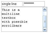 <form
id="form1"
runat="server"> Button Server ControlThe Button control is used to submit the form back to the server (postback). This happens automatically in opposite to other controls where you have to enable the AutoPostBack property to have the same effect. Buttons have a CausesValidation property to trigger validation of all validation controls assigned to the same group. It is possible to use several buttons in a container control like a DataGrid or a GridView. All these buttons have the same ID and it will be impossible to bind an event handler to each button control's OnClick event (or other event) to determine the particular button that was clicked. That's why buttons have a CommandName and CommandArgument property to determine which button you clicked and deliver the correct arguments to the event handler. There are three types of buttons: the standard button, the ImageButton (image acting as a button) and the LinkButton (link acting as a button). Notice that the ImageButton doesn't have a Text property, but instead it does have an AlternateText property which shows the entered text if the browser doesn't support images. 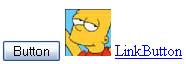 <asp:Button
ID="btnButton"
runat="Server"
Text="Button"
/> The most important event for a Button control is the OnClick event. This event is triggered with a click on the button and submits the form to the server. The OnCommand event is also triggered with a click on the button, but the values of CommandName and CommandArgument are also passed to the event. DropDownList Server ControlThe DropDownList control provides a single-select dropdown list. Each list item has a value and an index. You can add items to the list one by one yourself or by data binding a static array or another data source (e.g. results from a sql query). To bind a data source you'll be using the DataTextField property to link the text content and the DataValueField property to link the value of each list item. There are several ways to add items to the list at Design time. In design view you can use the smart tag 'Edit items' which shows on the dropdown list or you can click on the "..." next to the property Items. Both give the same window in which you can add the items one by one. Or you can write the code for each list item in the source view. 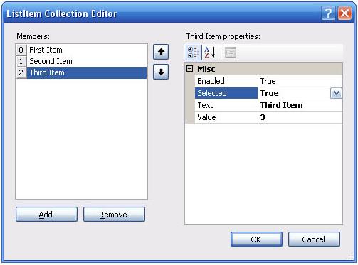 <asp:DropDownList
ID="ddlDropDownList"
runat="Server"> Adding items is not only limited to design time but can be done during run-time too. The best place to do this is in the Page_Load so you're sure everything is in your dropdown list before it is shown. It doesn't matter if you want to add them one by one or by data binding, both work fine. if
(!Page.IsPostBack) { You can use the OnSelectedIndexChanged event to dynamically change layout/content of your web page when the user chooses another item in the list. But don't forget to put the AutoPostBack property on true if you want this to happen automatically without having to click on a button. CheckBox(List) Server ControlThe CheckBox control accepts Boolean input and stores it in the Checked property: true if the box is selected or false if it's not selected.
Typically a checkbox is processed as one of several fields in a form. RadioButton(List) Server ControlThe RadioButton control permits you to intersperse the radio buttons in a group with other content on the page. Be sure you group the RadioButtons logically
by giving them all the same GroupName or you'll be able to select more than one. Panel Server ControlThe panel control is mainly used as a container for other controls. It's useful to group, hide or generate controls programmatically. If you generate controls programmatically you'll have to recreate them every time you load the page since the ViewState only remembers the state and not the controls you generated. If you only want to generate controls you can replace the panel by a PlaceHolder. With these controls you should be able to add quite a lot of functionality to your Web site. In Web Controls Sample Project you'll find a Visual Studio project that combines most of the controls you learned about in this tutorial into one single page. It can be used as a nice example. This tutorial is written by Assesino Tutorial toolbar: Tell A Friend | Add to favorites | Feedback | Google |