

Products
Database Search Solution (New Version) Search Control SEO Pager Highlighter Shortcut Controls Crypt Package Free ASP.NET Controls
Geotargeting Component ASP.NET Media Player Control Flash Video Player Control Services
ASP.NET Telecommute Jobs Free IP Location Lookup Test .Net Regular Expressions CSS/Table/DIV Page Layouts Custom Programming Article Sites Master List |
How to create ProgressBar user controlIn any user centric application, we always strive to make application more interactive and user friendly. When ever user performs any heavy or lengthy operation (Uploading/downloading a large file or Installation) he or she expects to know the progress of operation at regular intervals. The user should be made aware of status whether it may be success or failure at each step. We cannot keep user waiting. The user should be informed of percentage of task completed. This article discuss about the custom user control to create a smooth, incrementing ProgressBar control. It's typical user control which you can include in any of asp.net web application. This user control is a light weight which is built using a HTML table.
<%@
Control Language="VB"
AutoEventWireup="false"
CodeFile="ProgressBar.ascx.vb"
Inherits="ProgressBar"
%> ProgressBar User control propertiesFrom above HTML listing, you can observe that ProgressBar user control exposes many properties. You can use this properties to control the behavior of ProgressBar. BGColor: This property determines the Background color of ProgressBar user control. Default value for BGColor is Gray. You can configure BGColor of ProgressBar using this property. 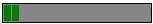 Blocks: This is an important property. Blocks will determine the number of vertical bars that will be displayed for each step. From the above HTML listing, you can observe that Blocks has value of 20. This value acts as a base value. Value Property and Block Property values are related using below given formulae which decide the number of vertical bars to be filled in bar at each step. Math.Ceiling((Me.Value * Me.Blocks / 100)) We can derive the following Table of values as shown below. This table based on initial base value of 20 for block property. So, at each step, ProgressBar will be filled with 2 vertical bars
Above figure should give fair idea how ProgressBar is filled at each step. Since, we used base value of 20; you can see that for each step, ProgressBar is incremented by two new Vertical bars. Border Color: This property determines the border color for the ProgressBar. Border Size: Determines the thickness of Border line for ProgressBar Fill Color: Determines the color for Vertical bars. Cell spacing: Technically speaking, ProgressBar is a simple HTML table with Vertical Bars being the cells inside table. To maintain space between Table cells, we use this property. Remaining properties determine the appearance of HTML table element. You can download source code for ProgressBar. Now that we understand the working principle behind the user control. We will add this user control to our page as shown below.
<uc1:Progressbar
ID="Progressbar1"
runat="server"
BGColor="Gray"
Blocks="20"
BorderColor="Black" Caution, whenever we add any user control to any page, we should register it with the page as shown below. <%@ Register Src="Progressbar.ascx" TagName="Progressbar" TagPrefix="uc1" %> We have added few labels to display the status in numerical and readable format. 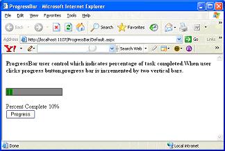 As shown in above figure, you can see that when user clicks Progress button, ProgressBar will be incremented by Value property set for user control.
If
(ViewState.Item("PBValue")
Is Nothing)
Then Above piece of code shows that for every click of Progress bar, ProgressBar user control's Value property is set by incremented value. This piece of code also checks to see if the ProgressBar has reached it's threshold value. When ProgressBar reaches it's threshold value, you can assume that work has been completed. You can see it in below output listing 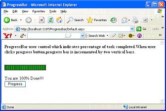 And that is it, ProgressBar completed its work, and this tutorial too :). Tutorial toolbar: Tell A Friend | Add to favorites | Feedback | |